Overview
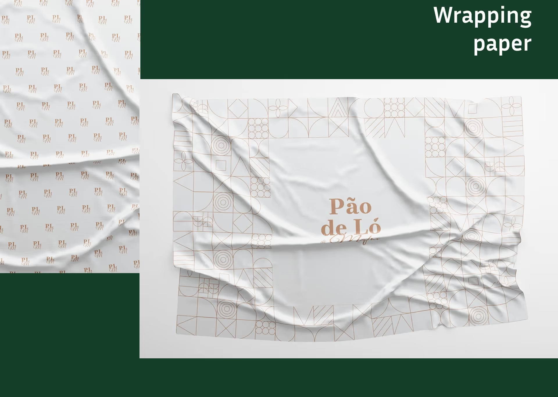
Coming from Mafra, where bread is central to local culture, Pão de Ló de Mafra produces a traditional sponge cake made from home-raised, free-range ingredients and certified eggs. The brand identity project aimed to translate this heritage into a visual language that feels authentic, premium, and rooted in Portuguese craft. A custom pattern — inspired by Portuguese decorative lines and the natural ingredients used in the cake — became a signature element applied across packaging and wrapping.
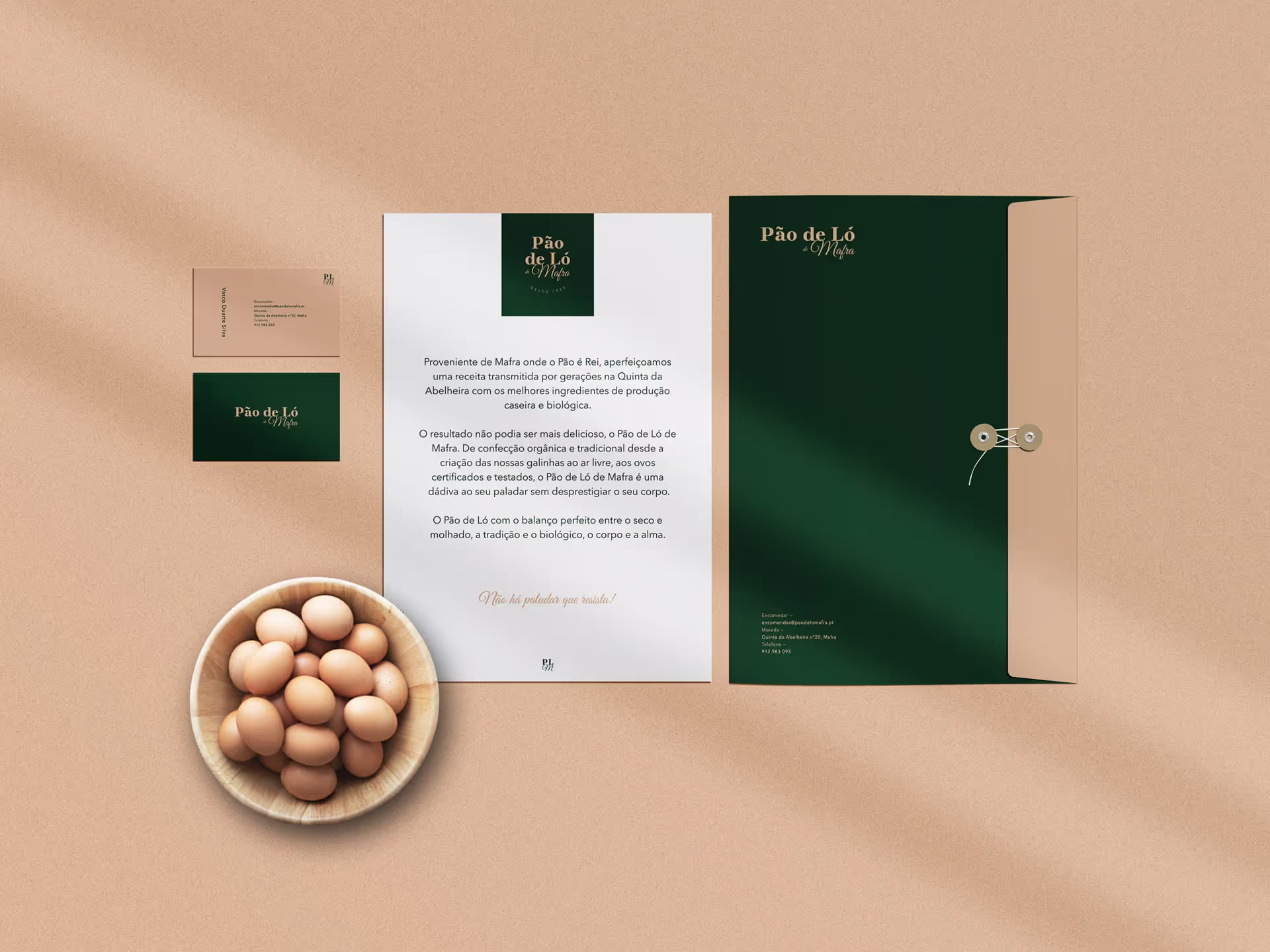
The brand system balances rustic warmth with refined execution, ensuring the product reads as both artisanal and premium on shelf and online. Deliverables included a full brand manual, packaging structure and artwork, stickers, business stationery, retail display mockups, and a shopfront signage concept.

Challenge
The main challenge was conveying deep local heritage and a handmade production process while achieving a premium, consistent visual identity suitable for retail. Packaging had to protect and present a delicate product, respect food-safety considerations, and still carry a strong, recognizable pattern. Additionally, the identity needed to scale across multiple touchpoints — small stickers, printed business cards, large store signage, and POS displays — without losing detail or legibility.

Solution / Approach
The work began with visual research into Mafra’s cultural motifs and traditional packaging for baked goods. A logo was developed that references craftsmanship and family tradition, balanced with contemporary typography to elevate perceived value.
A bespoke pattern was drawn to echo Portuguese line work and key ingredients (eggs, wheat, natural textures), designed specifically to adapt at different scales and on different materials (paper wrap, box lid, stickers). Packaging mockups were prototyped to test dimensions, folding, and sealing methods suitable for fragile cakes. A comprehensive brand manual defined colors, typography, pattern usage, and dielines.
Final deliverables included print-ready artwork, mockups for retail displays and a shopfront signage proposal, all delivered with production notes to ensure accurate implementation.
Key features & Highlights
Logo Design
– A mark that balances tradition and modern refinement, suitable for labels and signage.
Brand Guidelines
– Clear rules for color, typography, pattern, and usage across touchpoints.
Custom Packaging
– Structural and visual design for the cake box to protect and present the product.
• Pattern & Wrapping Paper
– Unique pattern inspired by Portuguese motifs and natural ingredients, applied to wrap and packaging.
• Stickers & Seals
– Functional branded stickers for secure and elegant packaging closure.
• Business Card
– Refined stationery reflecting artisanal and premium positioning.
Retail Display Mockups
– Expositor concepts to present products cleanly in stores.
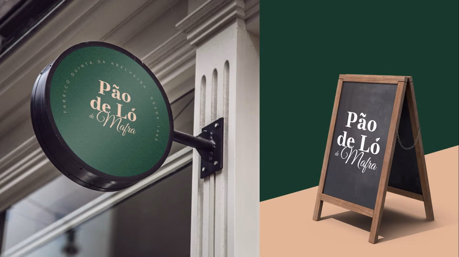
Signage Application
– Logo and visual system adapted for shopfront and in-store branding.
Results / Impact
The new identity elevated Pão de Ló de Mafra from a local craft product to a clearly branded premium offering. Packaging and pattern work created immediate shelf recognition and reinforced the product’s artisanal story. Production-ready guidelines and mockups smoothed the path to physical implementation, and the cohesive visual system allowed the brand to be applied confidently across small and large formats. Retail-ready packaging, clear signage concepts, and consistent marketing assets improved perceived value and prepared the brand for wider retail distribution and special editions.