Development of a full brand identity for Pão do Mestre, an artisanal bread brand rooted in Alentejo’s traditional baking heritage. The project included logo design, brandbook, social media setup, and print materials such as flyers and paper packaging for the bread. The goal was to capture the handmade, authentic, and high-quality essence of the brand while celebrating its cultural and regional origins.
Overview
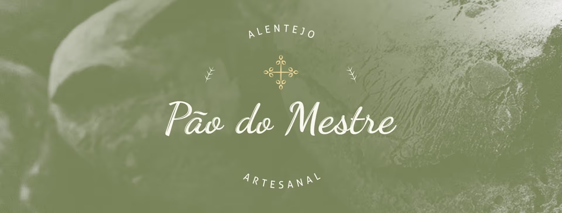
Pão do Mestre embodies the spirit of traditional Portuguese breadmaking — a return to craftsmanship, simplicity, and local ingredients. Produced in Alentejo using time-honored methods and regional raw materials, the brand communicates authenticity, care, and respect for tradition.
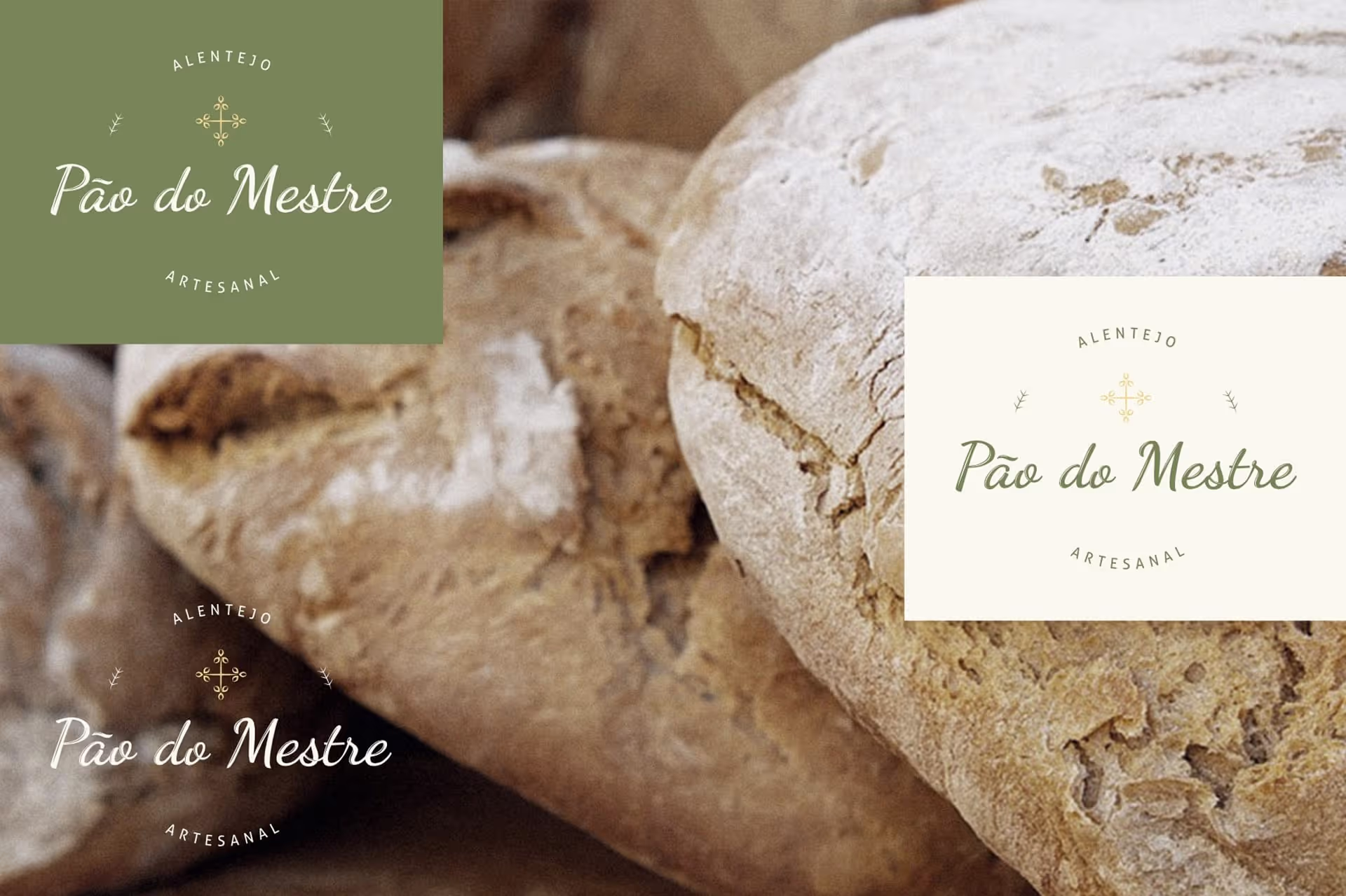
The design reflects this handmade essence through natural tones, organic shapes, and a logo inspired by both the Coat of Arms of Avis and wheat ears, symbolizing heritage and the ingredients’ purity. The signature-style brand name reinforces the artisanal and personal feel — as if each loaf carried the mark of its master baker.
The resulting identity balances rustic charm with contemporary clarity, honoring Portugal’s breadmaking culture in a modern way.
Challenge
The challenge was to design a brand that feels genuinely traditional and handmade, without appearing outdated. It needed to convey authenticity, locality, and craftsmanship while maintaining a clean, scalable identity adaptable to both digital and print contexts.
Solution / Approach
The creative direction focused on fusing traditional inspiration with modern execution. The logo combined an emblematic symbol referencing the Avis Coat of Arms and wheat ears, representing both the region and the product’s core ingredient. A handwritten logo style was chosen to reinforce the artisanal character.
A consistent visual system was established through the brandbook, defining typography, color palette, and application guidelines. Supporting materials — flyers, paper packaging, and social media templates (Facebook & Instagram) — extended the brand experience, maintaining visual harmony and emphasizing natural textures and tones.
Key features & Highlights
Logo Design
– Inspired by the Avis Coat of Arms and wheat symbolism.
Brandbook
– Complete guide with typography, color palette, and usage rules.
Social Media Setup
– Visual setup for Facebook and Instagram.
Print Materials
– Flyers and paper bread bags maintaining the artisanal feel.
Signature-Style Branding
– Reinforces handmade authenticity.
Cultural & Regional Inspiration
– Rooted in Alentejo’s baking traditions.
Consistent Visual Identity
– Unified look across digital and physical media.
Results / Impact
The final brand positioned Pão do Mestre as a premium artisanal bread with deep local roots. The handmade-inspired logo and natural color palette conveyed authenticity and trust, while the cohesive identity strengthened recognition both in-store and online. The project successfully captured the emotional connection between tradition, craftsmanship, and community — celebrating the timeless art of Portuguese breadmaking.
related projects
Other works from similar business fields.
The complete Brand Identify for Pão de Ló de Mafra including, business cards, packaging box and stickers